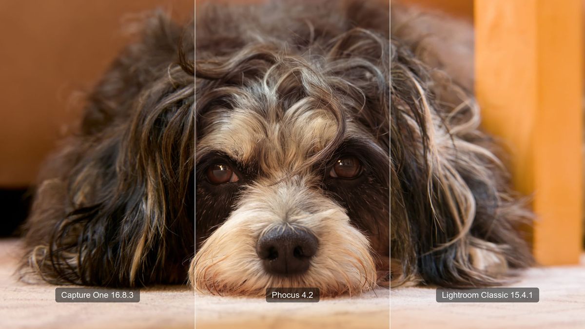
Last week I rendered the same photo of my wife's dog in three applications. Phocus 4.2, Capture One 16.8.3, Lightroom Classic 15.4.1, identical 3FR from my X2D II, all defaults. I got three noticeably different photographs.
My eye had opinions immediately. Capture One looked warmer and punchier, with shadows that fell off a cliff. Lightroom looked washed out and a little blue. Phocus sat somewhere in the middle, balanced in a way the other two weren't. Since Capture One added native Hasselblad support on July 2, every Hasselblad forum has been full of exactly these kinds of impressions, mine included. So instead of posting vibes, I printed a color chart, shot an ISO ladder, and measured what the three apps actually do to the same file. The full methodology and data tables live on a companion reference page; this post is what the numbers mean for choosing an app.
A note on support: This post represents my personal exploration and testing, not official technical support or guidance from Hasselblad. If you need assistance with your Hasselblad equipment, please contact Hasselblad directly: customersupport@hasselblad.com for global support, support.us@hasselblad.com for the Americas, or visit hasselblad.com/support for regional options.
Key finding: Measured in CIELAB¹ on identical Hasselblad X2D II RAWs, Capture One 16.8.3 renders midtones roughly half a stop darker than Phocus 4.2 at every ISO and boosts blue saturation, while Lightroom Classic 15.4.1 matches Phocus at base ISO and renders progressively brighter above ISO 800. Your unedited previews genuinely differ by app.
My eye was wrong about the most interesting one
Start with the impression I was most confident about: Capture One looked warmer than Phocus on that dog photo. The measurement says otherwise. At matched pixels, Capture One's hue barely moves; what it actually does is render the same midtones about 7 L* darker. Deep browns at equal color saturation read as richer and warmer to the eye, so "warmer" is what I saw. Darker is what was happening.
That one finding is why this post exists. If my eye invents a color shift where the instrument finds a brightness shift, then forum threads full of "app X has better color" impressions (again: mine included) may not be a reliable way to pick a RAW processor. Measurements are.
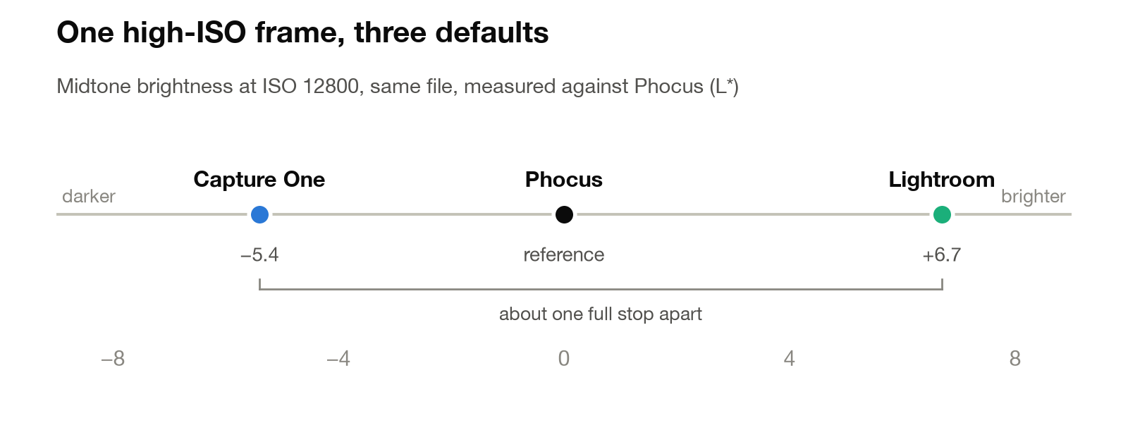
The overall scale of the differences surprised me too. On an ISO 12800 frame, Capture One and Lightroom rendered the same file essentially a full stop apart in midtone brightness, with Phocus almost exactly halfway between them. These are not subtle grading nuances you'd need a loupe to spot. They are different-looking photographs before you touch a single slider.
Capture One: darker, with blues that pop
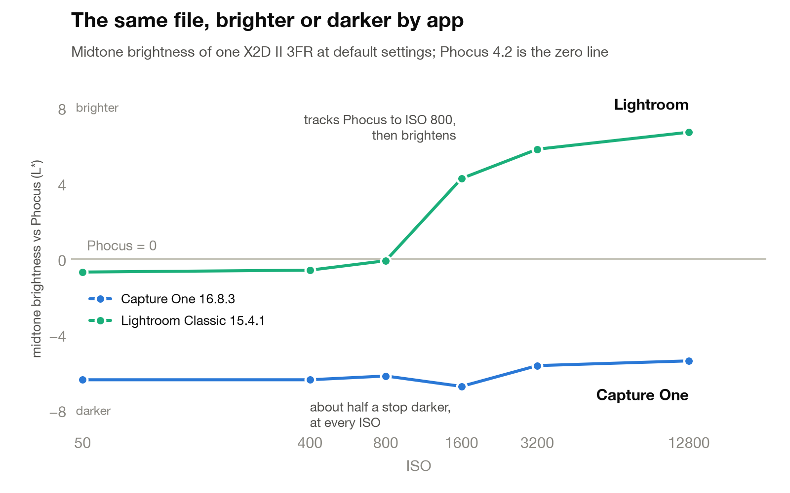
Across an ISO ladder from 50 to 12800, Capture One's character held remarkably steady: midtones 5.4 to 6.8 L* below Phocus on every single frame, roughly half a stop. It never flipped, indoors or out. If your Capture One imports look darker and moodier than the camera's own preview, that is the default rendering, not your exposure technique.
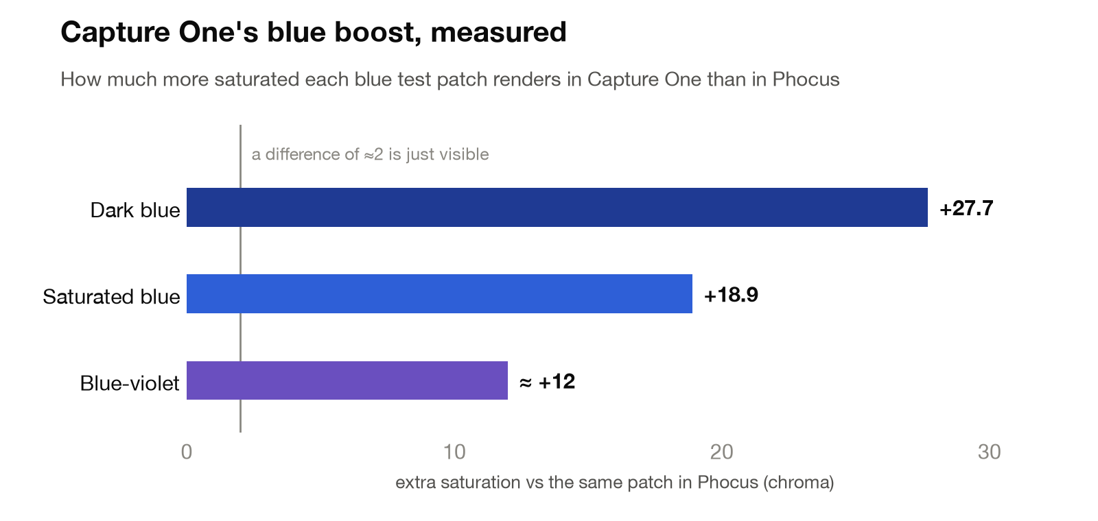
Its color signature is equally consistent: blue and blue-violet get a substantial saturation boost (18 to 28 chroma units on my printed test patches), cyan rotates toward blue, and greens lose a little saturation. One caveat travels with those numbers: they were measured on inkjet-printed patches, and ink is not sky. The direction is solid; I want a real saturated-blue scene before I quote the exact magnitudes as universal. But "Capture One makes blues pop" has, for this target at least, gone from potential forum lore to a measured fact.
Lightroom: brighter as the ISO climbs
Lightroom turned out to be the shape-shifter. At ISO 50 through 800 it tracks Phocus's brightness almost exactly. From 1600 up it pulls away: nearly +6 L* at ISO 3200 and +6.7 at ISO 12800. By the top of the range, an unedited Lightroom render is the brightest of the three by a wide margin, which is very plausibly why high-ISO Hasselblad files sometimes look "already lifted" when they land in Lightroom. The likely mechanism is the per-ISO baseline exposure offsets Adobe builds into its camera profiles, though I have not pulled the X2D II profile apart to confirm that, so file it as a strong hypothesis attached to a solid measurement.
The Hasselblad profiles have a separate problem of their own, one that is measurable rather than hypothetical: two of them are authored with the wrong ICC device class, so neither Phocus nor Lightroom will offer them as an export space: Hasselblad RGB Is Missing From Phocus for Mac and Lightroom Export Menus.
Two smaller Lightroom signatures showed up as well. Its highlights render measurably cooler than Phocus's, a blue shift that appeared on both a real photograph and the printed chart's paper white. And it desaturates pastels selectively: soft yellows through cyans lose 4 to 9 chroma units while soft reds, blues, and magentas stay put. That combination is a plausible mechanical basis for the "Lightroom looks washed out" impression Hasselblad shooters trade on forums, though tying a measured patch delta to a subjective impression of a whole image is interpretation, not measurement.
Beyond the tone curve, the color engine itself is closer to Phocus than I expected. Color scientists score how different two colors look with a number called ΔE, and the useful anchor is that a ΔE of 1 to 2 is about the smallest difference most people can spot with two patches side by side¹. Compared at matched tone, Lightroom's typical patch landed ΔE 2.4 from Phocus: right at the edge of noticeable. Capture One's landed at 4.0, a difference you can see without hunting for it. In plain terms: Lightroom mostly disagrees with Phocus about brightness, Capture One disagrees about brightness and color.
Researching and writing the blog and page posts I produce takes up a lot of my time and costs me money for software subscriptions, tooling, and other incidentals related to running a business.
Please consider a paid membership to help me keep the lights on and pay the bills - it is only a fraction of the cost of an X2D II and a lens. Click on the button to go to the membership page to see the options available.
Phocus: the reference in the middle
On every axis I measured, Phocus landed between the other two: tone placement, highlight warmth, blue saturation. I did not expect the camera maker's own software to read as the moderate one, but there it is.
Phocus is also, still, the only desktop application that renders Hasselblad's own HNCS color. Both Hasselblad and Capture One say plainly that the new native support renders Capture One's color, and Adobe has always rendered Adobe's. If HNCS is part of why you bought the camera, the measurement doesn't change the logic of keeping Phocus first in the pipeline; it just puts numbers on what the alternatives do instead.
The space HNCS renders into has since been measured the same way, primaries and all, together with what converting a frame to Adobe RGB actually moves: Hasselblad RGB Is Wider Than Adobe RGB.
Do you want your lens corrected, or flattened?
The unexpected finding of the whole exercise: the three apps disagree about your lens almost as much as they disagree about your file. Wide open at f/2.5, the XCD 55V naturally renders its corners noticeably darker than the center of the frame, and each app quietly decides how much of that vignette to remove for you. Lightroom and Capture One brighten the corners nearly all the way back up: the vignette is essentially gone. Phocus, deliberately or not, removes only about a third of it, so its corners stay visibly darker than the center. (The corner-by-corner measurements are on the data page.)
Neither choice is wrong. A flattened frame is technically cleaner; a half-vignette is arguably part of what a fast medium-format prime looks like. But you should know it's happening, because it means "corrections on" produces a visibly different image depending on the app.
One practical trap inside this: Capture One's falloff compensation lives in a Light Falloff slider that defaults to 100 and stays active even when you toggle lens corrections off. If you ever compare Capture One's rendering against anything else, zero that slider first. It cost me a full re-analysis before I found it.
So which one?
The answer the data supports: it depends on what you optimize for, but now you can pick with numbers instead of folklore.
- Pick Phocus if HNCS color or HDR output matters to you, or if you want the rendering that sits closest to neutral among the three. It remains my first stop for every file that survives the cull.
- Pick Capture One if you want its toolset and tethering ecosystem and you like a darker, punchier, blue-forward starting point. Nothing wrong with that look; just know it is a look, applied before you've touched anything.
- Pick Lightroom if you live in the Adobe ecosystem and shoot a lot of high ISO, with the understanding that its brightness varies by ISO and its pastels start slightly muted.
Related: the complete workflow that cull-first habit anchors.
And remember what defaults are: starting points. Every difference in this post is within trivial reach of an exposure or saturation slider. Where defaults genuinely matter is everywhere you don't edit: culling, previews, client galleries straight off the card, and the first impression that decides whether a frame survives.
What I haven't tested
The chart data comes from one camera, one printed target, and one session per scene, with duplicate frames confirming that a re-shoot returns the same numbers; the app-to-app differences are many times larger than any measurement wobble. I have not yet verified the blue-boost magnitudes on a real saturated-blue scene, tested whether the apps interpret an identical white balance setting identically, or compared denoisers seriously. Those may be next. If you want the full methodology, every table, and the list of limits, the companion data page has all of it.
My wife's dog, for the record, remains unbothered by all three renders.
References
- CIELAB is the standard scale for measuring color the way people see it, and it separates brightness from color: L* is lightness on a 0 (black) to 100 (white) scale, and two color axes carry hue and saturation. Two anchors for reading this post's numbers: a midtone shift of about 7 L* equates to half a stop, give or take, and a total color difference (ΔE) of 1 to 2 is about the smallest gap most people can spot with two patches side by side.
- Phocus vs Capture One vs Lightroom: Hasselblad RAW Color Test - the companion page with full methodology and data tables
- Capture One's Hasselblad Support: What You Get and What Stays in Phocus - what shipped on July 2
- Capture One 16.8.3 release notes