Since July 2, 2026, Hasselblad shooters have three serious RAW processors to choose from: Phocus 4.2, Capture One 16.8.3 with its new native 3FR support, and Lightroom Classic 15.4.1. Plenty has been written about which one to use. As far as I can tell, nobody has measured what they actually do differently to the same file.
Related: the companion post: what these numbers mean for choosing an app.
So I measured it. Same 3FR files from my X2D II 100C, rendered through all three applications at their defaults, exported as 16-bit TIFF, and compared numerically in CIELAB. This page is the data. If you want the practical "which should I use" discussion, that lives in What You Keep and Lose When You Skip Phocus and the Capture One post above; this one is for readers who want numbers.
Key finding: Rendering the same Hasselblad X2D II 3FR import image at defaults, Capture One 16.8.3 places midtones roughly half a stop darker than Phocus 4.2 at every ISO tested, while Lightroom Classic 15.4.1 matches Phocus at base ISO and brightens progressively above ISO 800. Capture One also boosts blue chroma substantially. These are measured CIELAB differences, not impressions.
Key findings at a glance
| Tone placement vs Phocus | Color signature | |
|---|---|---|
| Capture One 16.8.3 | Consistently darker: 5.4 to 6.8 L* below Phocus across ISO 50-12800 (roughly half a stop in the midtones) | Blue and blue-violet chroma boosted (+19 to +28 C* on test patches), cyan hue rotated 11-17 degrees toward blue, mild green desaturation |
| Lightroom Classic 15.4.1 | Matches Phocus through ISO 800, then brightens: +5.8 L* at ISO 3200, +6.7 at ISO 12800 | Yellow-through-cyan pastels desaturated (4-9 C*), highlights rendered visibly cooler; otherwise the closest match to Phocus's color |
| Phocus 4.2 | The reference point, between the other two | Hasselblad's HNCS rendering; also the only app that leaves part of the lens's natural falloff in place |
An unedited Capture One render will look darker and punchier than the same file in Phocus, and its blues will pop: that's the color engine, not your exposure. At high ISO, an unedited Lightroom render will look brighter than either competitor. And the moment you touch an exposure slider, all of this becomes adjustable; these numbers describe starting points, not limits.
The same data as pictures
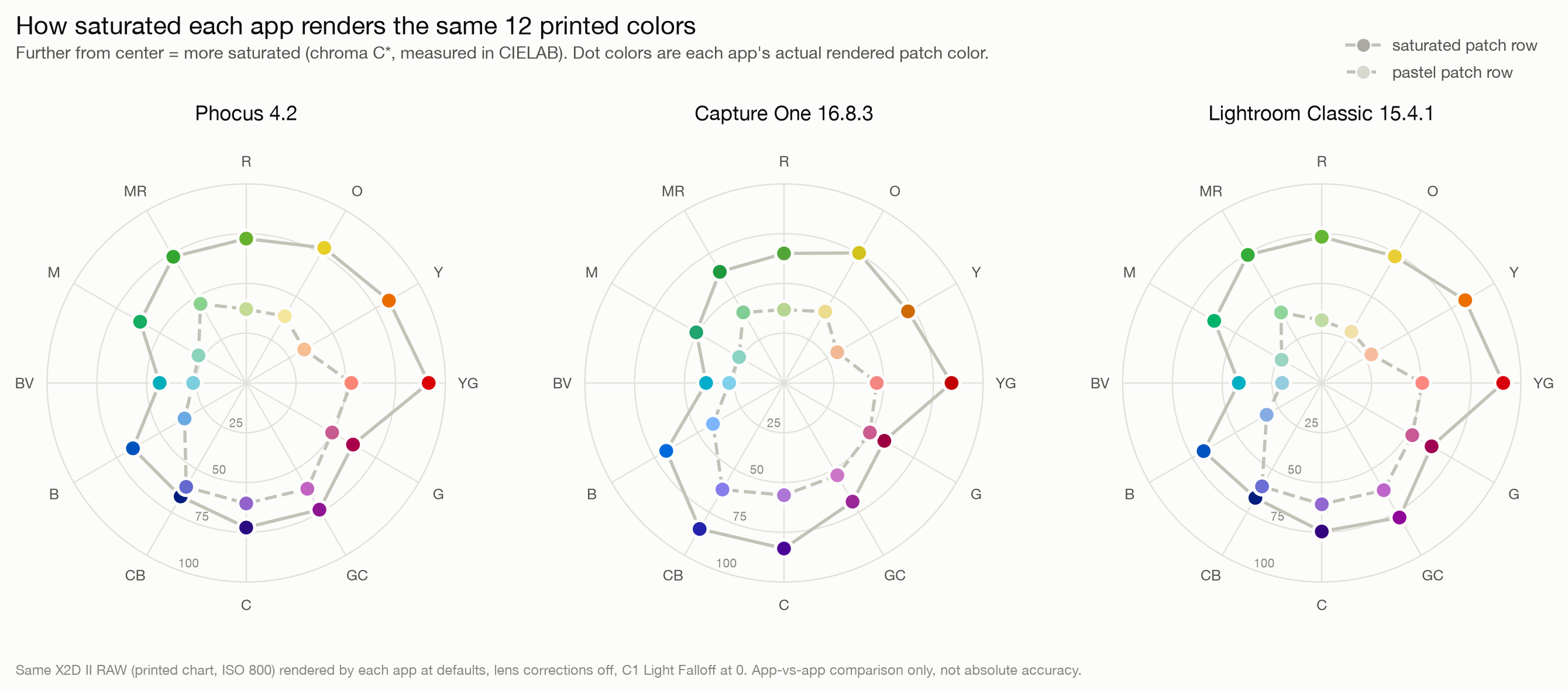
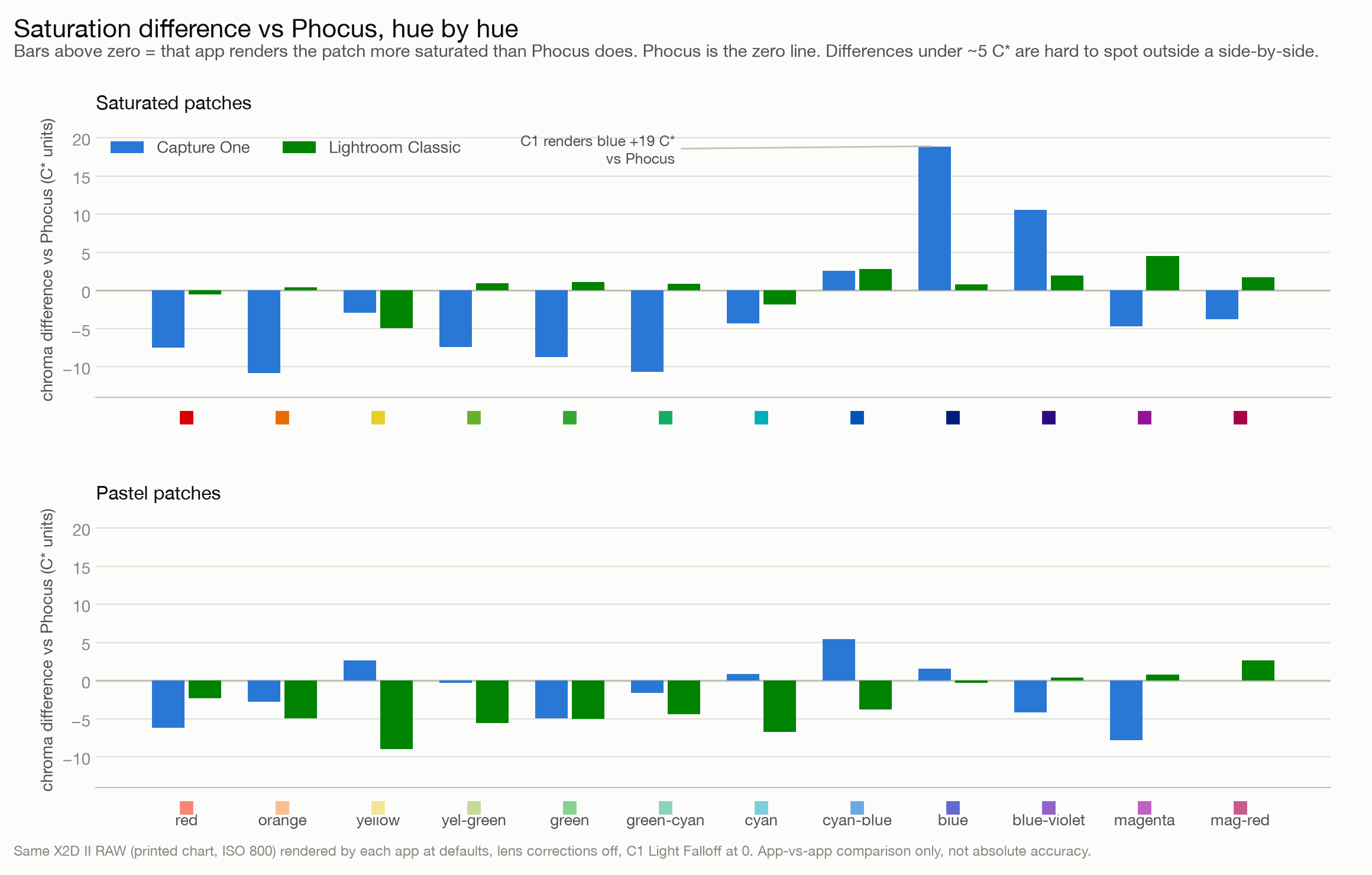
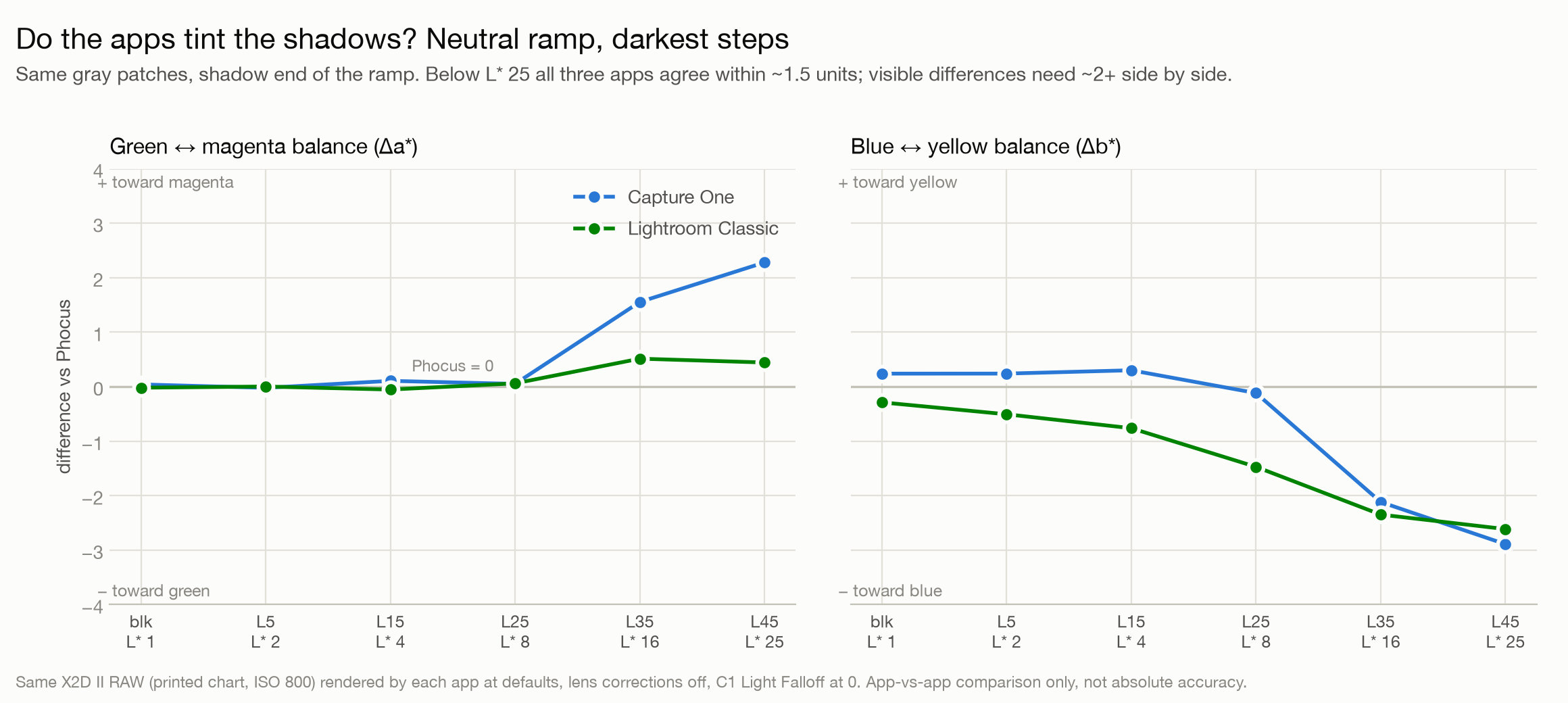
The tables on this page are precise but dense. These three graphs show the chart-frame color data at a glance: how saturated each app renders the 12 printed hues, where each app differs from Phocus hue by hue, and whether any app tints the deep shadows. All three use the corrected no-corrections trio (Capture One with Light Falloff at 0).
How I measured this
Equipment and versions. Hasselblad X2D II 100C, XCD 55V (one supporting frame with the XCD 2,5/90V), Phocus 4.2, Capture One 16.8.3, Lightroom Classic 15.4.1, all on macOS. Software versions matter here: every number on this page is specific to these releases and could change with any update.
Test material. A printed patch target (12-step neutral ramp, 36 hue patches at three saturation levels, skin/foliage/sky memory colors, corner fiducials for registration), photographed at ISO 50 through 12800, plus a real-world frame at ISO 12800. Duplicate frames were shot at four ISO levels to bound repeatability; duplicates agree within 0.22 L* everywhere.
Pipeline. Each app rendered the same 3FR at defaults with lens corrections disabled, white balance as shot, denoise off (except the real-world ISO 12800 frame, noted where cited). Exports were 16-bit uncompressed TIFF in each app's native export space (Adobe RGB from Phocus and Capture One, ProPhoto RGB from Lightroom). Every file was decoded through its embedded profile into CIELAB (D65, Bradford adaptation) using the colour-science Python library, so the different export spaces are normalized out before any comparison. I located patches by solving a perspective mapping from the target's corner fiducials, then averaged them in linear XYZ before converting to Lab.
Verification. Before publishing, the whole analysis went through an adversarial review pass. The colorspace conversion got round-trip tests (maximum error 0.007 L* units), and the embedded ICC profiles were checked byte-level against their specs. The review caught two real errors: a registration fault on four frames, and a statistical bias in noisy patches. Both got fixed by reprocessing every frame through a corrected pipeline. The numbers below are from that corrected pass. I mention this because a comparison like this is only as good as its error checking, and mine needed some.
The same RAW is a different brightness in every app
The headline number: rendering one correctly exposed chart frame, the midtone gray steps land at meaningfully different lightness in each app, and the pattern depends on ISO.
| ISO | Capture One minus Phocus (L*) | Lightroom minus Phocus (L*) |
|---|---|---|
| 50 | -6.4 / -6.4 | -0.7 / -0.7 |
| 400 | -6.4 / -6.4 | -0.6 / -0.6 |
| 800 | -6.2 | -0.1 |
| 1600¹ | -6.7 / -6.8 | +4.0 / +4.5 |
| 3200 | -5.6 / -5.7 | +5.9 / +5.7 |
| 12800 | -5.4 | +6.7 |
Two values per row are duplicate frames of the same scene. ¹The ISO 1600 frames were overexposed by about a stop (I ran into the 55V's 1/2000s shutter ceiling in bright shade), so treat that row as directional.
Capture One is simply darker, everywhere. Its offset barely moves across an 8-stop ISO range. Converting the midtone L* difference to luminance, Capture One's default places the mids roughly 0.4 to 0.5 stops below Phocus. On a second, indoor chart frame the gap was smaller (about -2.9 L*), so the exact size varies by scene, but the direction never flipped in any clean measurement I made.
Lightroom is the one that changes with ISO. It tracks Phocus almost exactly through ISO 800, then steps up: nearly +6 L* at ISO 3200 and +6.7 at ISO 12800. At the top of the range, Lightroom and Capture One defaults are more than 12 L* apart on the same file, which is close to a full stop of apparent midtone brightness. A plausible mechanism is Adobe's per-ISO baseline exposure offsets, a documented field in Adobe's camera profile format, but I have not verified the X2D II profile's actual values, so treat the mechanism as a hypothesis and the measurements as the fact.
If you have ever imported a high-ISO Hasselblad file into Lightroom and thought it looked brighter than it did on the camera's display or in Phocus, this is why. Nothing is wrong with your file.
Researching and writing the blog and page posts I produce takes up a lot of my time and costs me money for software subscriptions, tooling, and other incidentals related to running a business.
Please consider a paid membership to help me keep the lights on and pay the bills - it is only a fraction of the cost of an X2D II and a lens. Click on the button to go to the membership page to see the options available.
Whose color changes, and how?
With tone measured, the second question is what each app does to color once you compare at the same patches. The differences are smaller than the tone story but real, and they are not symmetrical.
Capture One's signature is blue. On the printed target, Capture One renders saturated blue at +18.9 C* higher chroma than Phocus, dark blue at +27.7, and blue-violet around +11 to +13. It also rotates cyan 11 to 17 degrees toward blue and mildly desaturates greens and oranges. These are the largest color differences measured anywhere in this comparison. One important qualifier travels with them: they were measured on inkjet-printed patches under one lighting setup, and ink spectra are not natural-world spectra. The direction is trustworthy; I would not carry the exact magnitudes to a real sky or real water until I have re-measured on a natural scene.
Lightroom's signature is quieter. Its saturated colors match Phocus within about 5 C* across the hue circle. The differences concentrate in two places: pastels from yellow through cyan lose 4 to 9 C* of chroma (red, blue, violet, and magenta pastels are essentially untouched, so this is hue-selective, not a global desaturation), and highlights render visibly cooler, a shift of 6 to 7 b* units toward blue that reproduced on both a real photograph and the printed target's paper white.
How different are they overall? Using CIEDE2000 color difference on the falloff-corrected chart data, Capture One sits at a median of 4.0 from Phocus across all 57 patches; Lightroom sits at 2.4. Commonly cited perceptibility thresholds for CIEDE2000 run from about 1.0 to 2.3 depending on viewing conditions, so Lightroom's color engine, once you match tone, hovers right at the edge of what most viewers would notice, while Capture One's differences are comfortably visible. For Hasselblad owners the practical summary is: Lightroom disagrees with Phocus mostly about tone, Capture One disagrees about tone and color.
If you want the deeper dive on what Phocus's own rendering pipeline is doing under the hood, my Phocus Histogram vs Capture One Levels comparison covers the tool-level differences, and the Essential Phocus 4.x guide documents the HNCS preset system these defaults come from.
Three opinions about the same lens
Because lens corrections are processing-time operations, one RAW file also lets you measure what each app's correction profile actually does. I exported the same 55V frame (f/2.5, where vignetting is strongest) from each app with corrections on and off, and measured the lift at the corner of the frame.
| App | Corner falloff compensation |
|---|---|
| Lightroom Classic | +23.1 L* |
| Capture One (Light Falloff at its default 100) | +20.9 L* |
| Phocus 4.2 | +8.1 L* |
Both third-party apps flatten the lens. Phocus doesn't. Adobe and Capture One compensate the 55V's falloff almost completely; Phocus compensates about a third as much, leaving a visible amount of the lens's natural corner darkening in the rendered file. Whether that reflects a deliberate Hasselblad rendering decision or simply a different profile calibration is not something this data can answer; I have not asked Hasselblad, and the numbers only tell you what happens, not why.
Two findings from this section surprised me enough to double-check:
- Capture One's falloff compensation is always on by default and lives outside the lens-correction toggle. The Lens Correction tool's checkbox controls distortion and chromatic aberration; a separate Light Falloff slider defaults to 100 and stays active even with corrections "off." If you are trying to compare Capture One's raw rendering against anything else, set that slider to 0 explicitly. Until I found it, it was quietly inflating both my brightness and my blue-chroma measurements. (Light Falloff at 100 shifted some off-center color patches by up to 11 chroma units, so it affects color, not just brightness.)
- Phocus's "standard" and "adaptive" lens correction modes produced identical output on a flat test target, matching within 0.02 L* on every patch. Whatever "adaptive" adapts to, a flat chart at a single focus distance does not trigger it. That is a separate investigation for a future post.
What can't this data tell you?
The limits of this data matter as much as the findings.
- Printed-target color numbers are printed-target color numbers. Inkjet ink reflectance spectra interact with each app's camera profile differently than natural spectra do. Directions are solid; exact chroma magnitudes need re-measurement on real scenes before you quote them at a dinner party.
- White balance was hard-set, but each app still interprets it. Every frame was shot with the camera fixed on Daylight white balance (5,000K on the X2D II), so all three apps received an identical WB setting. That removes one variable, but it does not guarantee each app translates that setting into identical channel scaling. Forcing the same numeric Kelvin and tint inside each app would separate any residual WB-interpretation differences from profile differences; I have not run that test.
- This is one camera, one main lens, one session per scene. Duplicate frames bound the measurement noise (well under 1 L*), but print-to-print, lens-to-lens, and day-to-day variation are unassessed.
- Defaults are not destiny. Every difference here is within trivial reach of an exposure or saturation slider. This page describes what the manufacturers chose as starting points, which matters for culling, previewing, and one-click workflows, not what any app can or cannot achieve after editing.
- The real-world ISO 12800 frame was processed with each app's denoise enabled, since that is how anyone would actually use it. Its numbers (Capture One about 7.5 L* darker in the mids than Phocus, Lightroom about 7.6 brighter) agree in direction with the chart data but carry the denoisers' fingerprints.
Have you seen the guide? I've published Essential Phocus 4.x for Mac - 85 topics across 8 sections and 251 pages covering everything from HNCS color science to HDR workflows. It's the reference manual Hasselblad hasn't updated since 3.8. It's $49, and updates are included.
Frequently asked questions
What target and equipment were used for these measurements?
A custom-printed patch chart (12-step neutral ramp from L* 5 to 95, 36 hue patches, memory colors, corner registration fiducials) shot on a Hasselblad X2D II 100C with the XCD 55V, plus one real-world frame with the XCD 2,5/90V. Software: Phocus 4.2, Capture One 16.8.3, Lightroom Classic 15.4.1.
How were the files compared?
Each app's 16-bit TIFF export was decoded through its embedded ICC profile into CIELAB (D65, Bradford chromatic adaptation) with the colour-science library, and identical patch regions were averaged in linear XYZ before conversion. Comparing in a single perceptual space removes the Adobe RGB versus ProPhoto RGB export difference.
Does the brightness difference change with ISO?
For Capture One, essentially no: it renders 5.4 to 6.8 L* darker than Phocus at every ISO from 50 to 12800. For Lightroom Classic, yes: it matches Phocus through ISO 800 and brightens progressively above that, reaching +6.7 L* at ISO 12800.
Are these results specific to the X2D II?
Yes, treat them that way. All measurements come from X2D II 100C files processed by these exact software versions. Other Hasselblad bodies share the color pipeline in Phocus, but I have not measured them, and Adobe and Capture One ship per-camera profiles that may behave differently.
Is one of the three apps "most accurate"?
This comparison cannot say. Measuring accuracy requires a target with known reference values (a ColorChecker) rather than a printed chart, which tells you how the apps differ from each other, not which is closest to the scene. That is a planned follow-up.
References
- Hasselblad camera and lens support in Capture One - Capture One support article
- Capture One 16.8.3 release notes
- colour-science - the open-source colorimetry library used for all conversions
- Adobe DNG specification - documents the camera-profile fields, including per-ISO baseline exposure offsets, referenced as a hypothesis for Lightroom's high-ISO behavior