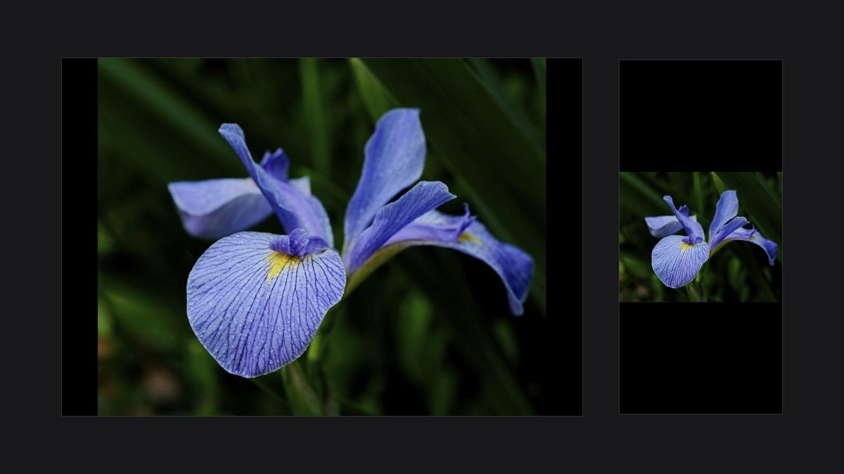
You've probably noticed it. Open the same X2D II file on your iPhone and then on your iPad Pro and the iPad version looks meaningfully better. The tonal transitions are smoother, edge separation is cleaner, and the file feels three-dimensional in a way it didn't a moment ago on the smaller screen.
Most people chalk this up to screen size or display tech. The real explanation is mostly about your eye. The iPhone has higher pixel density than the iPad Pro. If raw resolution were the story, the iPhone would win.
Key finding: An iPhone 17 Pro Max has higher pixel density (460 PPI) than the iPad Pro M4 (264 PPI), yet still loses for X2D II image review. Angular extent on your retina is the cause. The iPad places the image inside the peak of your contrast sensitivity curve, where micro-contrast and tonal gradations become perceptible. Display tech is secondary.
Why do X2D II files look better on iPad than iPhone?
Two reasons, in order of impact. First, the larger screen places the image at a higher angular size on your retina, hitting the peak of human contrast sensitivity around 3 to 5 cycles per degree, which is where micro-contrast and subtle tonal gradations become visible. Second, display differences like Reference Mode and HDR brightness add a smaller secondary effect.
That ordering is the part most coverage gets backwards. Display tech is the visible answer, so it gets the credit. Angular size is the invisible answer, so it doesn't. The X2D II's 100-megapixel files happen to live exactly where this matters: the small, soft, structured transitions that medium format renders so well.

Why doesn't the iPhone's higher pixel density help?
Because pixel density is the wrong bottleneck. The iPhone 17 Pro Max, for example, has a Super Retina XDR display at 460 PPI. The iPad Pro 11-inch (M4) by contrast has an Ultra Retina XDR display at 264 PPI. The iPhone is denser per inch by a wide margin. Both are 10-bit, both are P3 wide-gamut, both run through the same Core ImageIO decode and color management pipeline.
What changes is angular extent. Hold the iPhone 17 Pro Max in portrait at typical reading distance, around 25 to 30 centimeters, and its 73-millimeter screen width letterboxes a landscape X2D II file into roughly 14 to 17 degrees of horizontal visual field. Hold the iPad Pro 11-inch in landscape at maybe 35 to 45 centimeters and its 232-millimeter screen width shows the same file at roughly 29 to 37 degrees. The iPad puts the image across about twice the angular width on your retina, and that's with the smallest iPad Pro in the lineup paired against the largest iPhone in the lineup.
That difference matters more than the pixel count behind each device. PPI controls whether you can see individual pixels at a given distance. Angular extent controls whether you can see the patterns those pixels form.
Have you seen the guide? I've published Essential Phocus 4.x for Mac - 85 topics across 8 sections and 251 pages covering everything from HNCS color science to HDR workflows. It's the reference manual Hasselblad hasn't updated since 3.8. It's $49, and updates are included.
How does contrast sensitivity decide what you actually see?
Your visual system is not equally sensitive to all spatial frequencies. The contrast sensitivity function (CSF), first measured by Campbell and Robson in 1968¹, peaks around 3 to 5 cycles per degree of visual angle for typical viewing luminance. Above and below that band, your ability to detect contrast falls off sharply.

This is the load-bearing fact for the iPad observation. When an image is small on your retina, the fine tonal transitions and micro-contrast in it sit at higher spatial frequencies, in the region where your CSF is already falling off. The information is on the screen. Your eye can't pull it back into perception. Make the same image larger on the retina and those same transitions shift into the CSF peak. Suddenly they read.
For an X2D II file with 100 megapixels of tonal information and the kind of slow gradient work medium format does best, this is the whole game. The file has the data. Your eye needs angular room to resolve it.
The same physics is why prints look the way they do, why darkroom contact prints from medium format negatives feel different from the same image on a phone, and why a 30-inch monitor at a desk feels different from a 65-inch TV in a living room. Distance and size together set angular extent. Angular extent sets which part of your CSF curve does the work.
Researching and writing the blog and page posts I produce takes up a lot of my time and costs me money for software subscriptions, tooling, and other incidentals related to running a business.
Please consider a paid membership to help me keep the lights on and pay the bills - it is only a fraction of the cost of an X2D II and a lens. Click on the button to go to the membership page to see the options available.
Where do Reference Mode and XDR brightness fit in?
They help, but at a smaller magnitude than angular extent. The iPad Pro has a setting called Reference Mode (Settings → Display & Brightness → Advanced → Reference Mode) that locks the display to a calibrated reference color space with controlled gamma and a fixed brightness target. It tracks specifications like Rec. 709 SDR, Rec. 2100 HDR PQ, sRGB, and P3-D65. Turning it on disables True Tone, auto-brightness, and Night Shift while active. The iPhone has no equivalent toggle.
Reference Mode is available on the iPad Pro 12.9-inch starting with the M1 generation (2021) and on every iPad Pro M4 (2024 and later, both 11-inch and 13-inch sizes). Earlier 11-inch iPad Pros did not include it.
For HDR content from your X2D II, both displays publish the same headline HDR peak brightness of 1600 nits. The difference is in panel architecture and what each can hold across screen area. The iPad Pro M4's Ultra Retina XDR uses tandem OLED (two stacked OLED layers driven together) and is designed to sustain bright output across meaningfully large bright regions. The iPhone 17 Pro Max uses a conventional OLED panel and hits its peak on small bright zones but dims sooner when a luminous region grows to fill the frame. For an Ultra HDR JPEG with a sky occupying half the image, the iPad shows you the frame closer to how it was authored.
The Phocus Guide's Display Requirements for HDR Viewing topic covers the HDR-specific side of this in more detail, including which devices support full HDR rendering and which iOS conditions (Low Power Mode, thermal throttling) suppress it. The Hasselblad HDR guide covers how HNCS HDR encodes the wide dynamic range that benefits most from those displays.
What's the best way to review X2D II files in practice?
A few practical takeaways from how this physics plays out.
Match your viewing distance to your evaluation goal. Reviewing fine detail and edge work on a phone screen at 30 cm is a losing fight against the CSF. The same file on the same phone at 15 cm from your eye gives you back some angular extent at the cost of needing to scan around. Pick the geometry that matches what you're looking for.
Use Reference Mode for tonal evaluation if you're on a supported iPad. Your color and tonal calls will be more predictable. Brightness drops, which can feel like the image lost punch, but that's the calibrated reference appearance, not a problem with the file.
Don't cull final decisions on a phone. Phone screens work for rejecting obvious failures and triaging volume, where you only need to recognize broad properties. Final selections, where you're discriminating between two strong candidates on subtle differences, need angular room. A laptop screen is the practical minimum.
Prints still win for a reason. A 20x30-inch print at a reading distance of 50 cm covers a much larger fraction of your visual field than any practical screen. The CSF physics that explains the iPad versus iPhone observation explains why a print at proper viewing distance feels different from any display. The display you carry around is always making a compromise that the print doesn't have to.
Why medium format needs angular room to land
Photography has always been about deciding what your image is. Hasselblad's rendering decisions, applied through HNCS color science², the tonal curves in Phocus, and the way the X2D II sensor handles transitions in the deep end of its dynamic range, live in the file as a set of small, careful, structural choices. The renderer made them with the assumption that someone would eventually view the image at a size where those choices would register.
Shrink the result down to a phone screen at arm's length and you're filtering it through a perceptual aperture that throws away most of what the rendering is doing. The image still works. It still tells you whether the composition lands. But the part you paid for, the subtle tonal work and the medium-format sense of dimensional separation, doesn't get into your visual cortex at that scale.
The iPad gives the file an angular size where the rendering can be read by the only instrument that counts: the visual system of the person doing the looking.
References
- Campbell, F. W., & Robson, J. G. (1968). Application of Fourier analysis to the visibility of gratings. The Journal of Physiology, 197(3), 551-566.
- Michels, K. (2026). What Is HNCS HDR? Hasselblad's End-to-End HDR Explained. Tech Behind the Frame.