A reader mail landed last week with the kind of question I like best: what am I doing wrong, or is this a bug? This time it was the Grayscale panel. Tick the checkbox and the photo goes black and white, as expected. Then drag any of the RGB sliders and the whole frame brightens or darkens together, like an exposure control that wandered into the wrong panel. Push one slider to -100 and the frame goes black. Not "the reds go dark". Black.
My first reaction was to agree. I opened an ordinary landscape frame in Phocus 4.2.2, dragged Red down, and watched the entire image dim. A brightness slider in a channel-mixer costume, case closed.
Except I have learned, the slow way, not to trust my eyes on a preview. So I put a ColorChecker in front of the camera and started reading actual patch values. That is where things got a little more interesting.
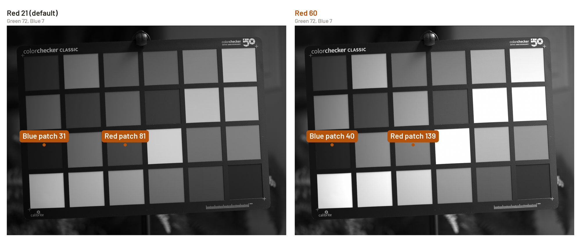
Key finding: Phocus 4.2.2's Grayscale panel is a per-channel luminance mixer with absolute RGB weights, not a global brightness control. On a ColorChecker frame, raising Red from 21 to 60 lifted the red patch roughly 65 percent more than the blue patch. It looks global because nearly every real pixel carries all three channels.
Why does a selective tool look global on an ordinary photo?
Because almost nothing you photograph is a pure, saturated color. Skin tones, foliage, sky, weathered wood: all of them carry meaningful amounts of all three channels at once. When you raise the weight the mixer assigns to one channel, every pixel that contains that channel shifts by some fraction, and in a typical frame that's nearly every pixel. The shift isn't uniform across the image, but on a scene with no strongly separated colors the differences between pixels are too small to notice next to the shift they all share.
Selectivity in this panel is proportional, not binary. It only becomes visually obvious when a patch is heavily saturated in one channel and starved in the others, which is exactly the condition a ColorChecker is built to provide and an ordinary photograph usually isn't.
What I actually measured
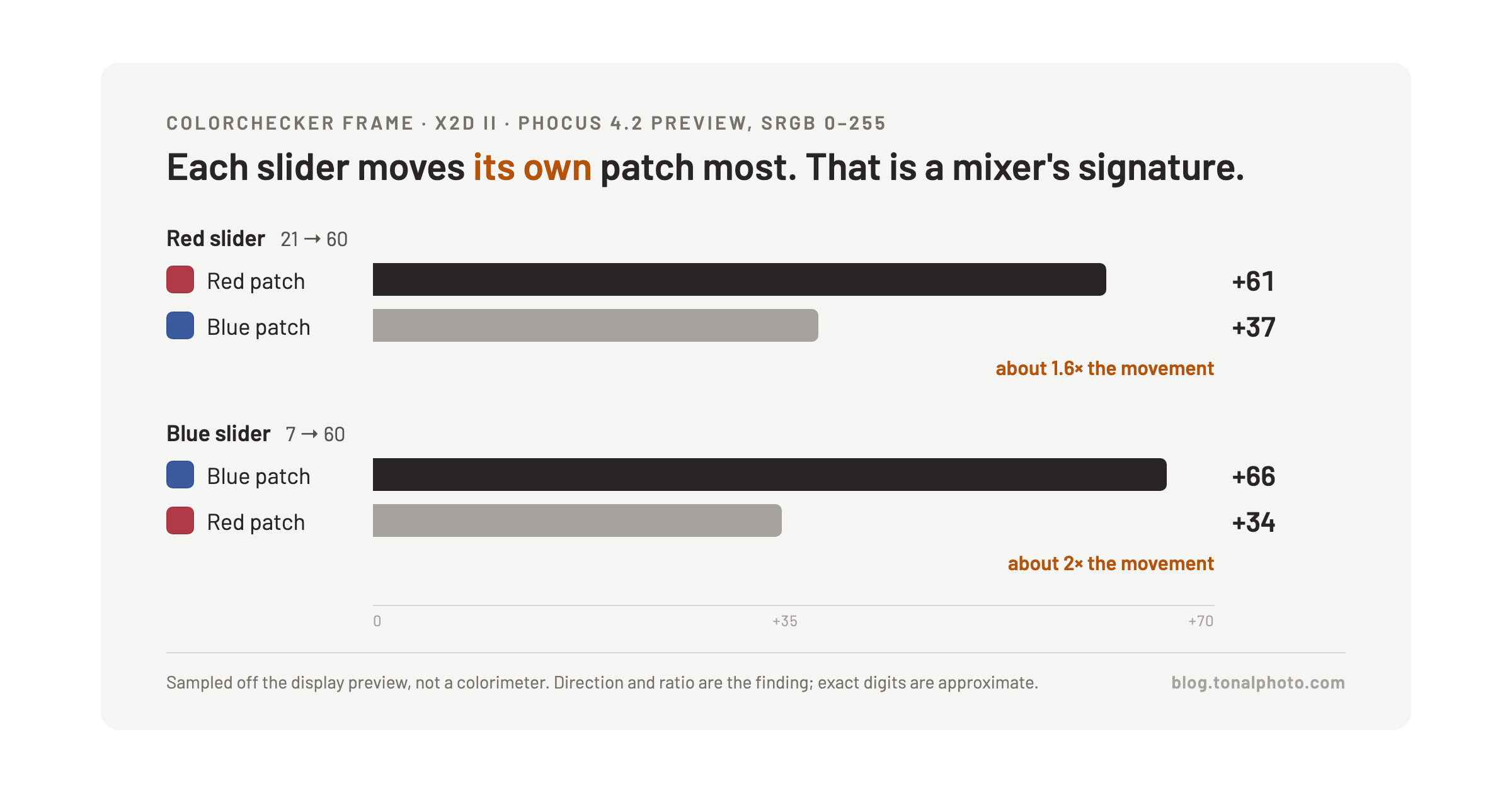
I shot a ColorChecker frame on the X2D II, enabled Grayscale in Phocus, and sampled patch values off the rendered preview before and after moving individual sliders. A caveat has to sit right next to these numbers: the preview is display sRGB, not a colorimeter reading off a calibrated target, so the magnitudes below are approximate. The direction and the ratio between patches is the finding. Treat the exact digits as illustrative, not as a spec.
| Slider moved | Patch sampled | Change |
|---|---|---|
| Red: 21 → 60 | Red patch | +61 |
| Red: 21 → 60 | Blue patch | +37 |
| Blue: 7 → 60 | Blue patch | +66 |
| Blue: 7 → 60 | Red patch | +34 |
| Red: 21 → 60 | White patch | clipped at 255, unmeasurable |
| Blue: 7 → 60 | White patch | clipped at 255, unmeasurable |
Raising Red moved the red patch about 1.6 times as much as the blue patch. Raising Blue reversed that relationship almost exactly: the blue patch moved about twice as much as the red patch. That's the signature of a per-channel weighting function, not a single global gain applied to every pixel equally. The white patch is in the table for completeness and nothing else. It contains all three channels near their maximum already, so it clipped to 255 in both tests and can't tell you anything about the mixer's ratios.
The measurement data behind this post is a download for paying members: the Phocus screenshots with readouts and the figure sources. Membership keeps this research going.
Researching and writing the blog and page posts I produce takes up a lot of my time and costs me money for software subscriptions, tooling, and other incidentals related to running a business.
Please consider a paid membership to help me keep the lights on and pay the bills - it is only a fraction of the cost of an X2D II and a lens. Click on the button to go to the membership page to see the options available.
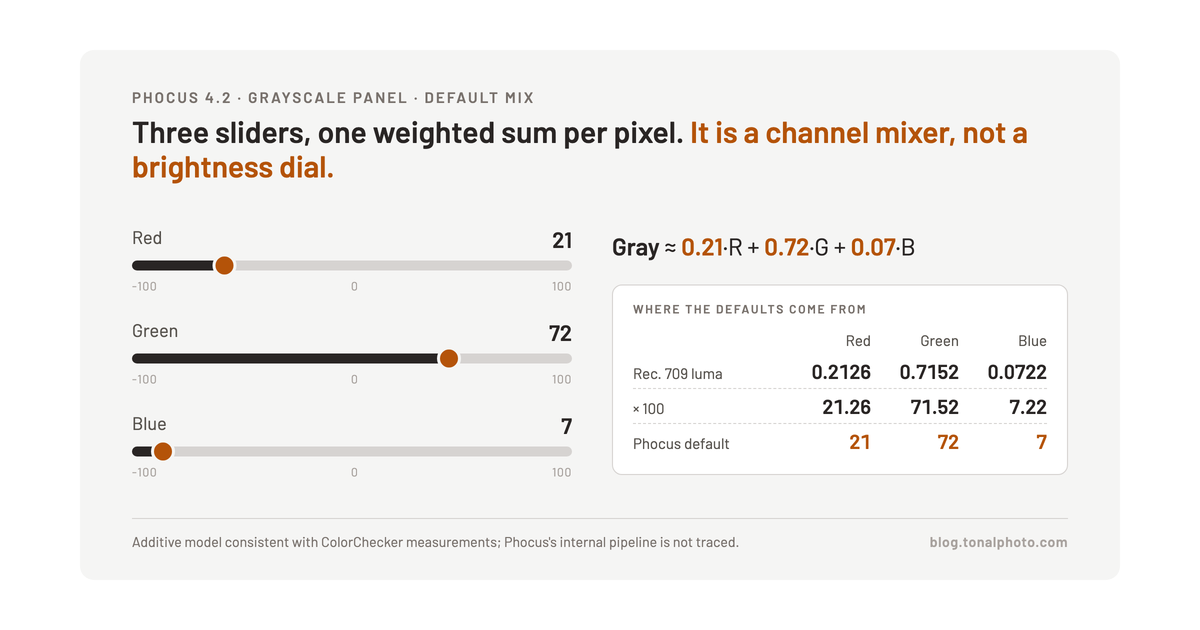
The defaults are close to Rec. 709 luma weights
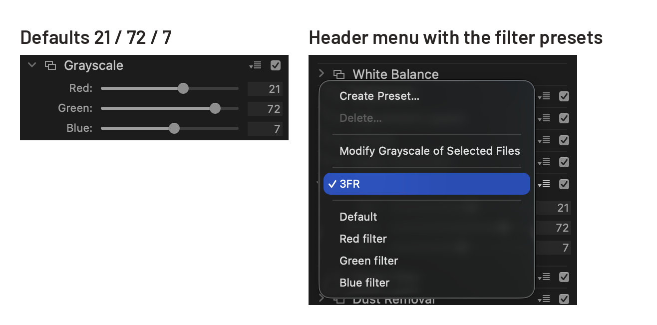
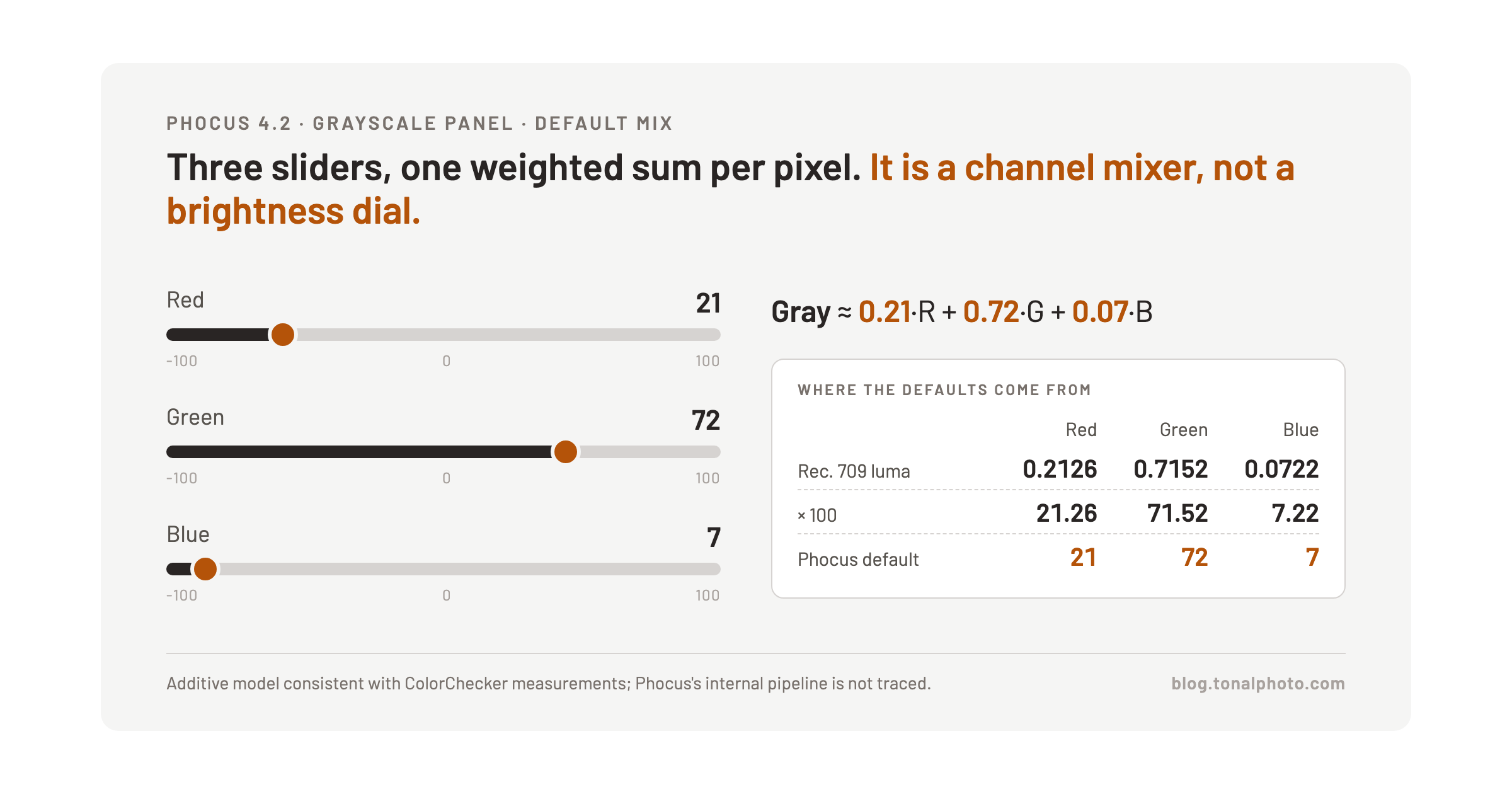
Phocus opens Grayscale with R=21, G=72, B=7. Scale the Rec. 709 luminance coefficients, 0.2126 red, 0.7152 green, 0.0722 blue, up to a base of 100 and you get 21.26, 71.52, 7.22. That's a close match to what the sliders show at default, close enough that it's clearly not a coincidence.
I want to be precise about what that does and doesn't tell you. The defaults closely match the Rec. 709 weights. I haven't traced Phocus's internal color pipeline, so I can't say whether the mixer operates in the same linear-light space those coefficients assume, or at what stage in the render it applies relative to HNCS. Read it as strong circumstantial evidence that the default conversion follows the standard broadcast luma formula, not as a verified statement about the internal math.
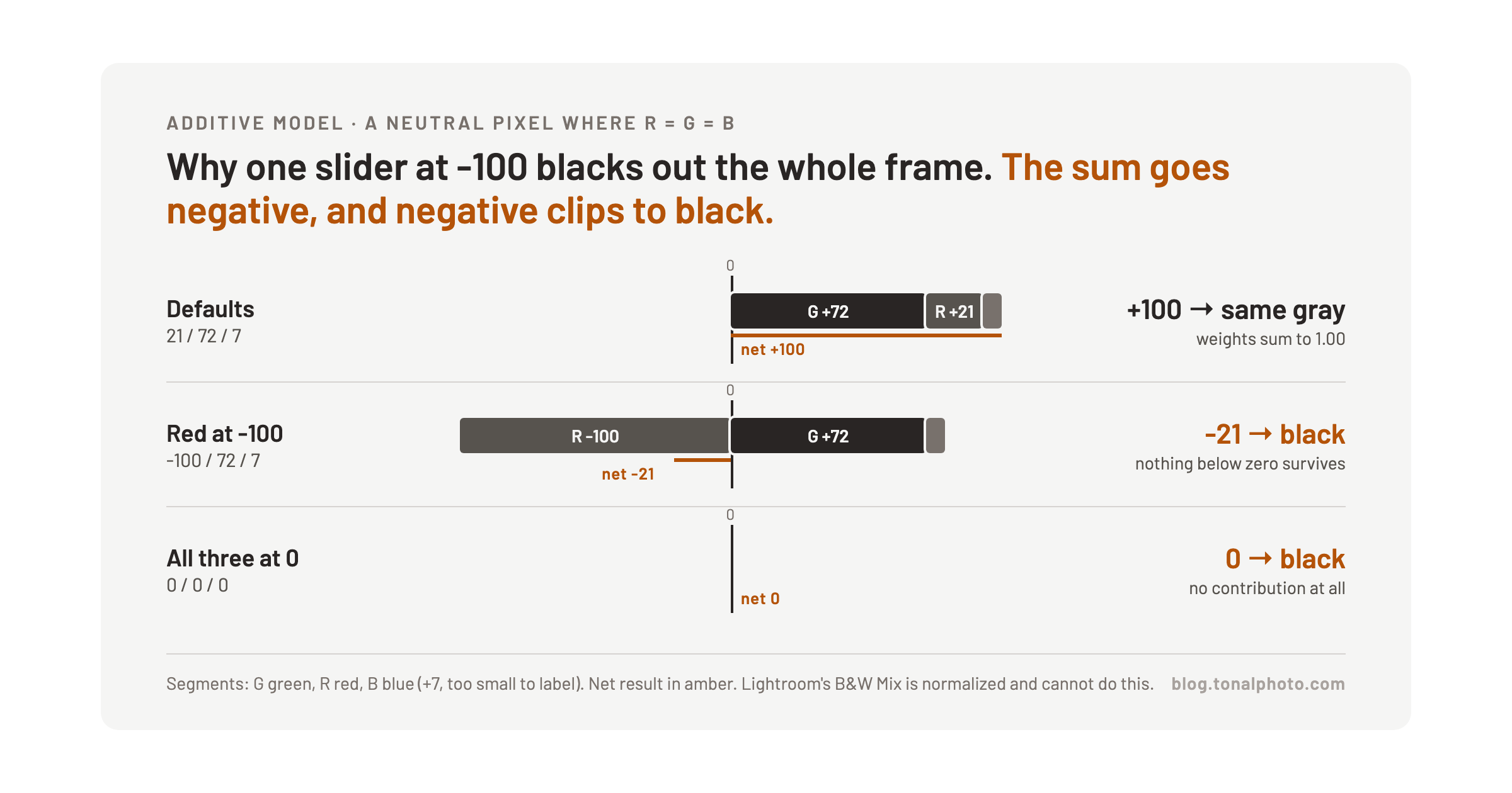
Why does a single slider at -100 black out the frame?
This part follows straightforwardly once you treat the sliders as weights in a sum rather than as independent brightness controls. Set all three to 0 and the weighted output for every pixel is 0, a black frame, which is consistent with an additive model where the sliders scale each channel's contribution before they're added together.
Leave the other two sliders at their defaults and push one hard negative, and the weighted sum for most pixels swings below zero, because the channel you just inverted was contributing a meaningfully positive amount before. A value below zero has nowhere to go but clip to black. Lightroom's Black & White Mix does not behave this way, and that is the reader's fairest point. Its eight sliders target hue ranges and sit on a normalized base, so dragging Blue to -100 on a frame with no blue in it does almost nothing, and no single slider can black the frame out. The reader followed up with a side-by-side of the same frame in both apps, and it shows exactly that. Phocus's three sliders are absolute weights on the RGB channels, and the math doesn't care that you only meant to suppress reds: it computes the sum you asked for.
Have you seen the guide? I've published Essential Phocus 4.x for Mac - 85 topics across 8 sections and 251 pages covering everything from HNCS color science to HDR workflows. It's the reference manual Hasselblad hasn't updated since 3.8. It's $49, and updates are included.
The filter presets are the faster path for most edits
The Grayscale panel's header menu carries Red, Green, and Blue filter presets alongside Default, each emulating the contrast effect of shooting black and white film through a colored glass filter over the lens: a red filter darkens blue skies and lightens skin, a blue filter does the opposite. For most conversions these presets get you closer to a finished look in one click than dialing three sliders by hand, and they're worth reaching for first. The manual sliders earn their place when a preset gets close but not quite right, or when you're working a frame the presets weren't built around.
Why do the three histograms look identical with Grayscale on?
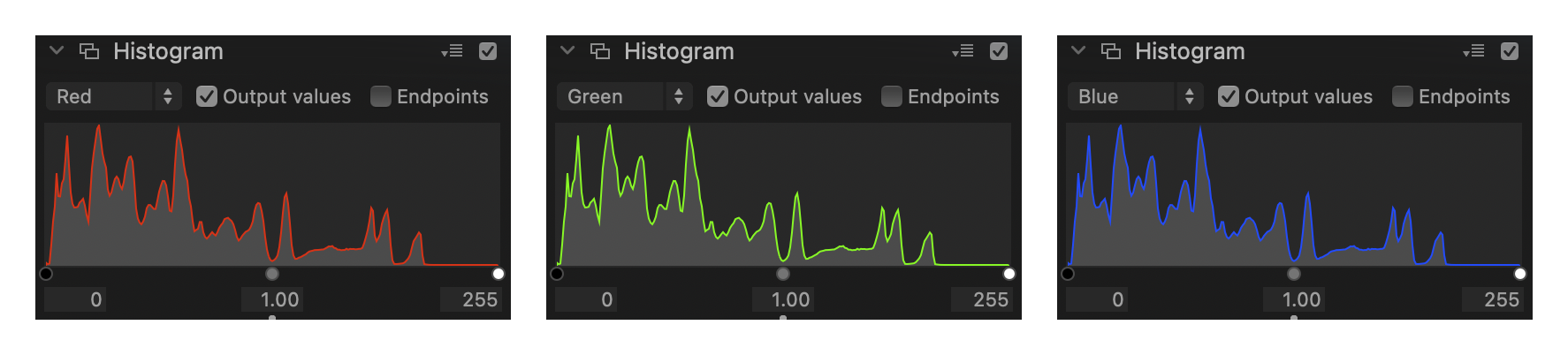
One box to check first, because it changes what the panel shows: Output values, in the Histogram panel header. With it unticked, which is how my install came up, the histogram plots the input data and ignores the Grayscale sliders completely. I dragged Red to -100, watched the frame go black, and the histogram did not move. Tick it and the panel plots the rendered output, which is where the rest of this section applies.
Because after conversion, every pixel has R equal to G equal to B. Grayscale collapses the three channels into one value per pixel and writes that same value into all three, so the three per-channel histogram views are reading identical copies of the same data. Move the Red slider while you're looking at the blue channel's histogram and it responds exactly as if you'd moved the blue slider, because by the time the histogram renders, there's no difference between the channels left to show.
That's not a bug. It's arithmetic doing exactly what identical channels look like. The reader's report of symmetric per-channel histograms was accurate, and it's the direct evidence for what conversion does, not a sign that something is broken.
The underlying critique still stands as a fair one. Phocus's histogram already diverges from familiar conventions elsewhere in the app, and showing three identical channel views once Grayscale is on adds a layer of confusion that a single gray histogram, the way Lightroom's black and white panel handles it, would avoid without losing any information. Three redundant histograms tell you nothing that one wouldn't.
How to actually see the mixer working
Don't test this on a landscape with muted, overlapping colors. Pull up a frame with strongly separated hues instead, a red barn against green foliage, or a blue sky over orange sandstone, and the selectivity becomes obvious within a couple of clicks: one slider moves one region and barely touches the other. On a typical frame, reach for the filter presets first and save the sliders for the cases where you need to push past what a preset gives you.